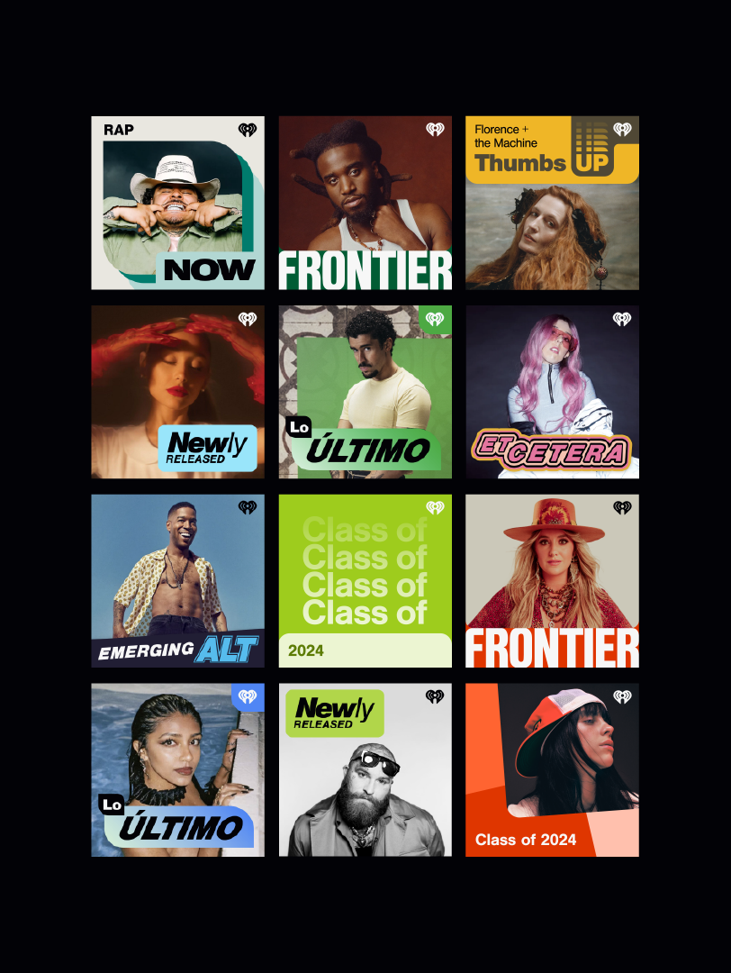
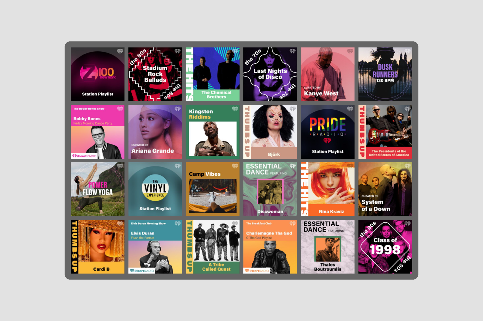
Reframe the Request Around Scale
The work shifted from redesigning individual playlist tiles to building a repeatable system that could support a growing editorial catalog without custom design for every launch.
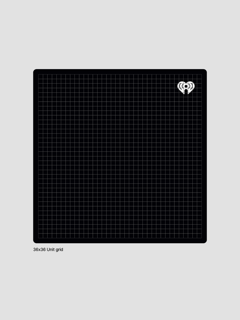
Create a Shared Structural Foundation
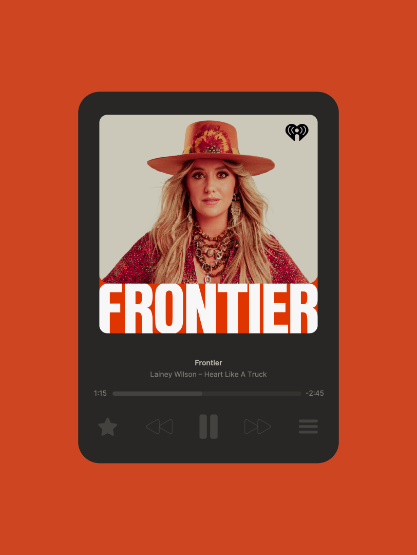
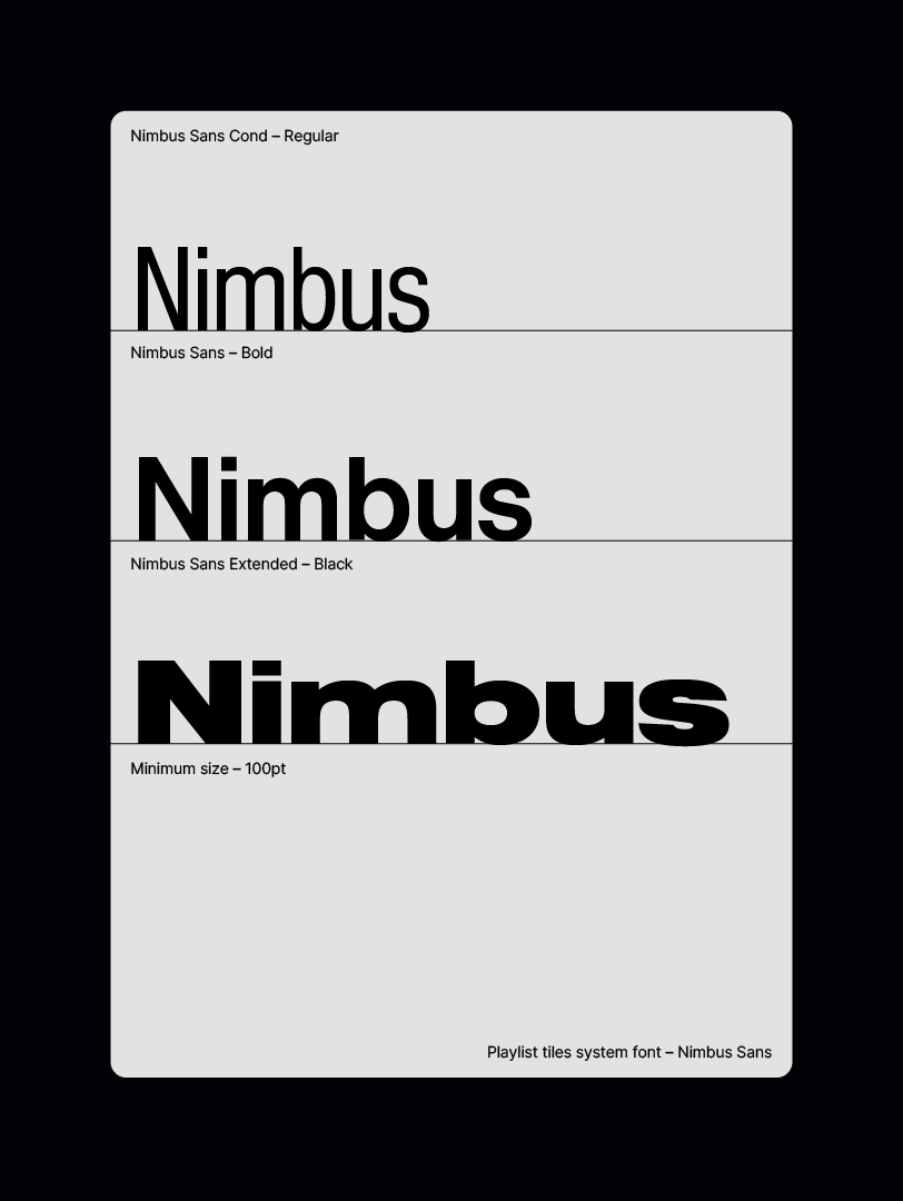
Standardize Type for Legibility
A fixed grid, safe zones, and locked iHeart bug placement gave every tile the same underlying structure, making the system easier to recognize and maintain.
Nimbus Sans, clear hierarchy, minimum size rules, and predictable title behavior helped playlist names stay readable across app, web, and player contexts.
Translate the Rules Into Templates
Editable content areas and locked system elements allowed the SDM team to update images, titles, and colors without breaking the visual system.
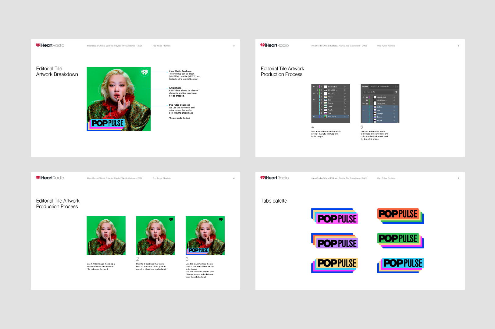
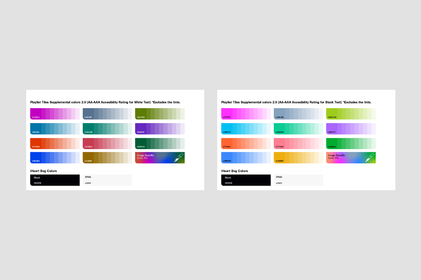
Build Color Rules Around Contrast
The color system balanced expression with accessibility, using tested pairings for light and dark text to protect legibility at small sizes.
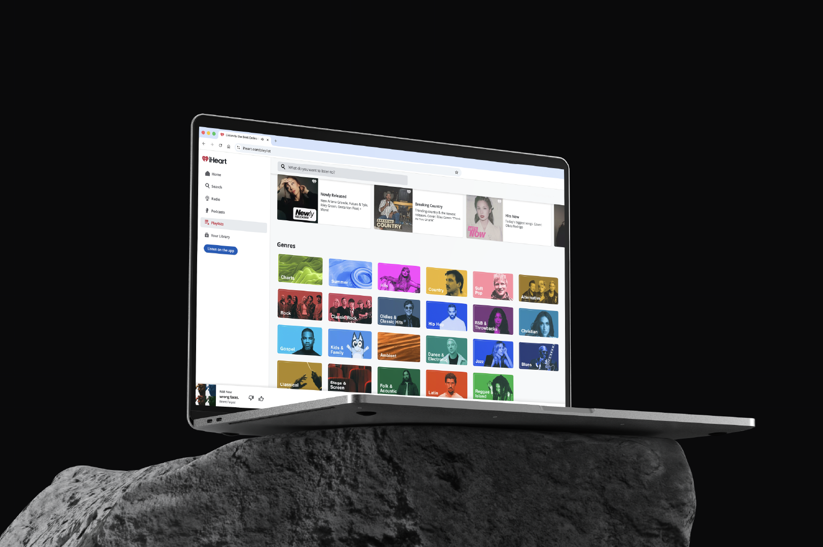
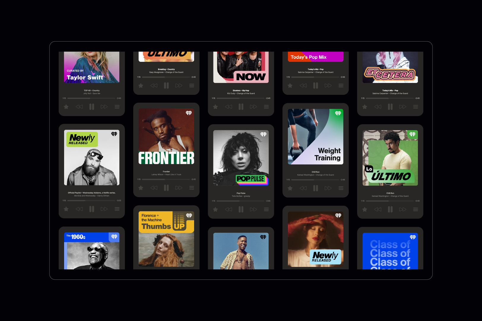
Validate Across Real Placements
The system was tested in grids, player modules, and web/app views to ensure it held together in the places listeners would actually see it.